
Software development
UI UX Design Services: Product Design, Design Systems and UX Audits From the Team That Also Builds the App
Written scope and quote after the call. NDA on request. You own the code.
Quick answer
aibrevo offers UI UX design services for apps, web platforms and internal tools: research, wireframes and prototypes, a design system with type, colour and components, and final screens our own engineers build. Every case study in our portfolio includes a design system board, and three of them are shown on this page with their real fonts, hex codes and WCAG 2.2 contrast checks.
Builds like this
Part of the guide: Software development
Key takeaways
- Our UI UX design services cover research, wireframes and prototypes, a design system, final screens and a UX audit, and the same in-house team then builds what it designed.
- Every case study in our portfolio includes a design system board: one type family in five weights (Regular to Extrabold) and a four-colour palette with hex codes. Stridely, Common Faktor and the Miami Dolphins suites platform are shown below.
- Design pays off in numbers: Jetstarix quote-request completion rose from 22% to 71% after we rebuilt its quote flow, and 41% of Miami Dolphins suite sales now complete without a sales call.
- We check designs against WCAG 2.2 (W3C Recommendation): 4.5:1 contrast for normal text, 3:1 for large text and UI components, and pointer targets of at least 24 by 24 CSS pixels at Level AA.
- Design work is quoted on scope: screens, user types, research and whether a design system exists. We send a written quote after a free 30-minute call.
Our UI UX design services turn a product idea or an existing app that underperforms into a tested prototype, a design system and build-ready screens. We design mobile apps, web platforms, customer portals and internal tools for startups, growing businesses and larger operators. What sets us apart from a design-only agency is that our in-house engineers then build what we designed, so nothing gets lost between the design file and the shipped product. One result: after we rebuilt the Jetstarix quote flow, quote-request completion went from 22% to 71%. Our design-led builds reached first release in 5 to 9 weeks, and every project is quoted in writing after a free call.
From our Jetstarix, Miami Dolphins, Common Faktor and StackStack case studies.
What do our UI UX design services include?
You can hire us for one piece or the whole product. Each deliverable below is something you keep.
| Service | What happens | What you get |
|---|---|---|
| UX research | Interviews, analytics review, competitor flows, jobs-to-be-done | Personas or user types, key journeys, problem list |
| Information architecture | Navigation, content hierarchy, user roles | Sitemap or app map, role matrix |
| Wireframes and prototypes | Low-detail layouts, then a clickable flow tested with users | Wireframes, clickable prototype, test notes |
| UI design | Visual direction, final screens for every state | Screens for iOS, Android and web, including empty, loading and error states |
| Design system | Type scale, colour palette, contrast pairings, spacing, components | A design system board and a component library developers build from |
| UX audit | Heuristic review, drop-off analysis, WCAG 2.2 checks | Ranked issue list with fixes, ordered by impact and effort |
| Product design services | All of the above, tied to the business goal and the build | A product that is designed and built by one team |
What does a design system we delivered look like?
Every case study in our portfolio includes a design system board: one type family shown in five weights (Regular, Medium, Semibold, Bold, Extrabold), a four-colour palette with named colours and hex codes, and a screen grid that shows the system applied. Here are three, exactly as delivered.
Stridely: a warm palette for a group fitness app
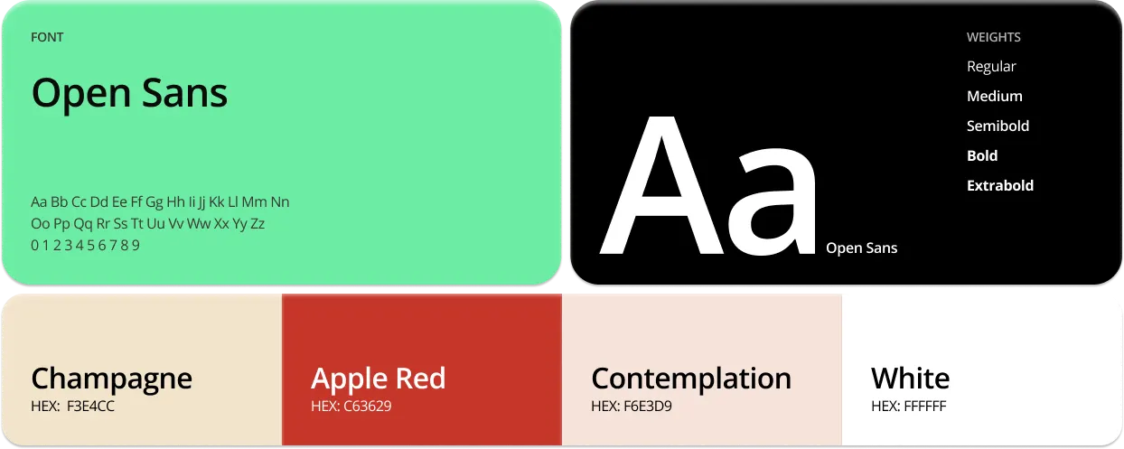
Stridely is built around small accountability groups, so the system had to feel friendly rather than competitive. Open Sans carries every screen; the soft Champagne (#F3E4CC) and Contemplation (#F6E3D9) backgrounds keep the feed calm, and Apple Red (#C63629) is reserved for the one action that matters on a screen, such as joining a challenge.
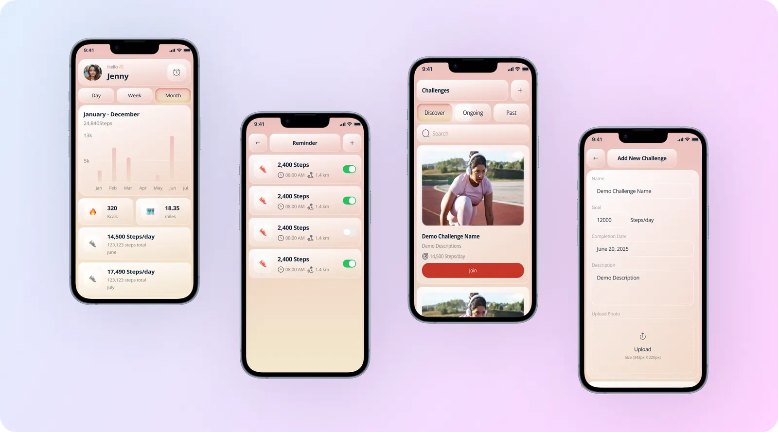
Ninety-day retention is 52%, against roughly 8% for solo fitness trackers. Built in 6 weeks, design included.
Common Faktor: a confident palette for a dating app
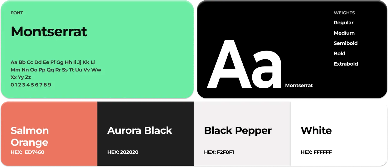
Common Faktor matches South Asian singles on compatibility factors the user controls, and the match screen explains why two people surfaced. The geometric Montserrat and a Salmon Orange (#ED7460) accent on mostly white screens keep profiles and photos in front, with Aurora Black (#202020) for text and Black Pepper (#F2F0F1) for quiet surfaces.
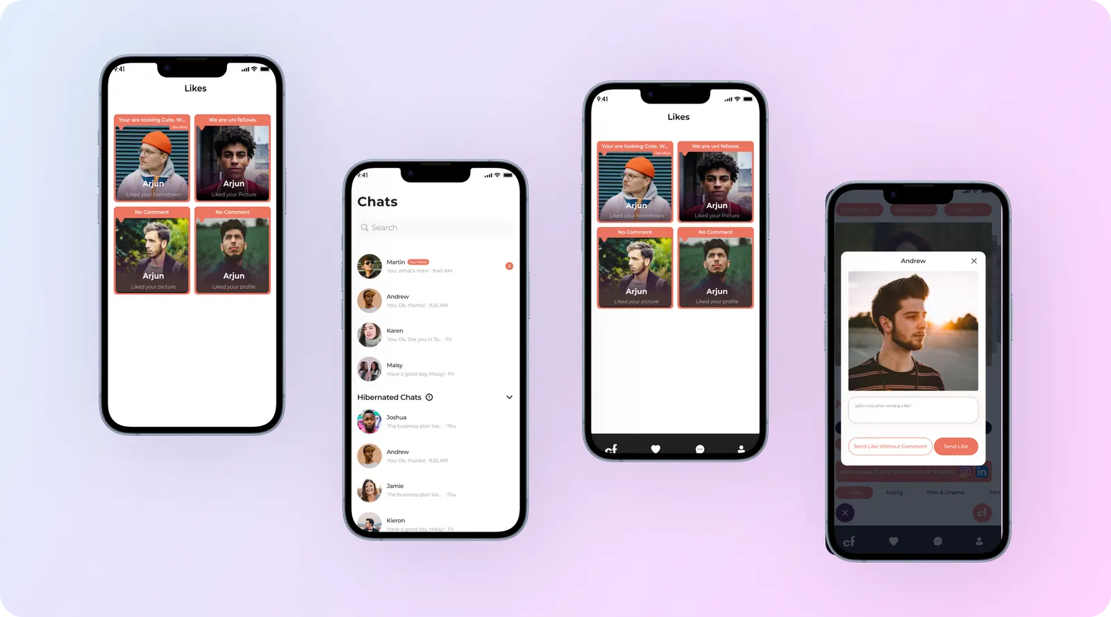
The first-message reply rate is 3.4 times that of the mainstream apps the founders benchmarked, and the app reached 140,000 registered users in 18 months. Built in 7 weeks with UX/UI, development and product strategy from our team.
Miami Dolphins: a premium palette for suite sales

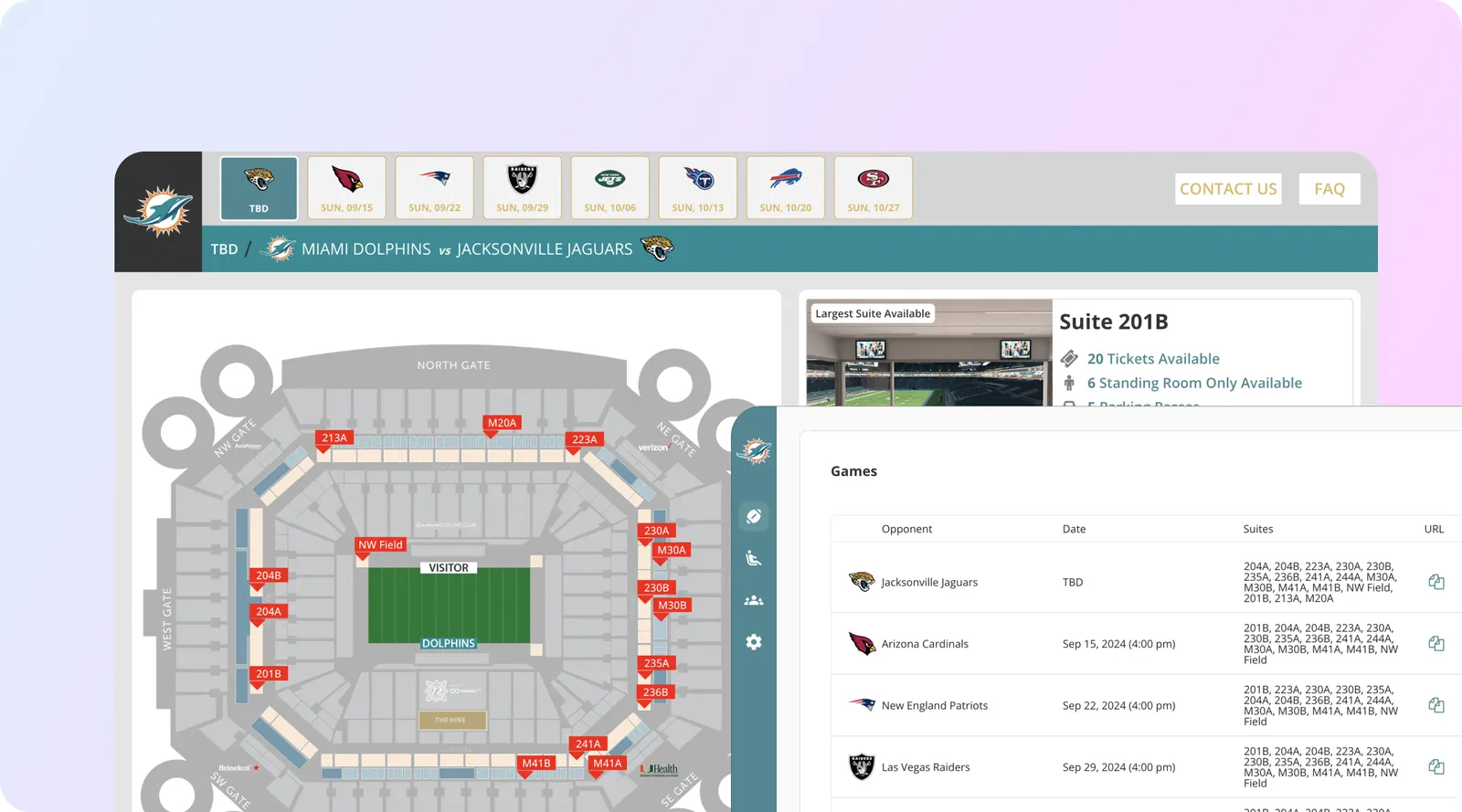
The suites platform sells premium hospitality, so the system pairs Glossy Teal (#008D96) with a gold-toned Equator (#DEB764) for calls to action such as Request Info, on top of an interactive suite map with sightline previews. The same system runs the admin side, where staff edit games, opponents and suite inventory.
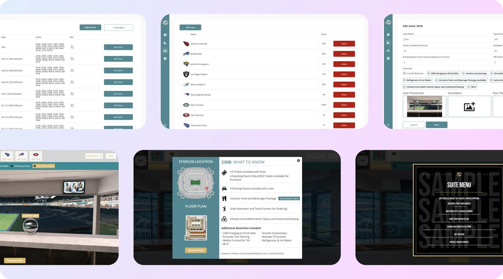
Suite enquiry to signed contract fell from 21 days to 6, and single-game suite revenue rose 2.4 times. Built in 9 weeks.
How do we check a palette for accessibility?
A palette is not finished until every text and background pairing has a known contrast ratio. WCAG 2.2 (a W3C Recommendation) sets the bar at Level AA: at least 4.5:1 for normal text, 3:1 for large text (at least 18 point, or 14 point bold) and 3:1 for UI components and graphics against adjacent colours (WCAG 2.2, success criteria 1.4.3 and 1.4.11, checked Oct 31, 2026). We compute the ratio for each pairing with the WCAG relative luminance formula and write the result into the design system, so developers know which pairings are allowed where.
Here are the calculated pairings for the three palettes above:
| Pairing (foreground on background) | Contrast ratio | Normal text (4.5:1) | Large text and UI (3:1) |
|---|---|---|---|
| White on Apple Red #C63629 (Stridely) | 5.30:1 | Pass | Pass |
| Black on Champagne #F3E4CC (Stridely) | 16.78:1 | Pass | Pass |
| Aurora Black #202020 on White (Common Faktor) | 16.29:1 | Pass | Pass |
| Aurora Black #202020 on Salmon Orange #ED7460 (Common Faktor) | 5.64:1 | Pass | Pass |
| White on Salmon Orange #ED7460 (Common Faktor) | 2.89:1 | Fail | Fail: decorative use only |
| White on Glossy Teal #008D96 (Miami Dolphins) | 4.00:1 | Fail | Pass: large or bold labels only |
| Black on Equator #DEB764 (Miami Dolphins) | 11.06:1 | Pass | Pass |
| White on Equator #DEB764 (Miami Dolphins) | 1.90:1 | Fail | Fail: avoid |
Ratios calculated with the WCAG 2.2 relative luminance formula from the hex codes on each design system board. Thresholds from WCAG 2.2, checked Oct 31, 2026.
That is what a design system adds over a mood board: the same colour can be right for a button fill and wrong for small text on top of it, and the rule is written down before anyone builds a screen.
Contrast is one check of several. WCAG 2.2, published as a W3C Recommendation on Oct 5, 2023, added nine success criteria, including 2.5.8 Target Size (Minimum), 2.5.7 Dragging Movements, 2.4.11 Focus Not Obscured, 3.3.7 Redundant Entry and 3.3.8 Accessible Authentication, and removed 4.1.1 Parsing (What’s new in WCAG 2.2, checked Oct 31, 2026). These are the targets we design to:
| Check | Requirement | Source |
|---|---|---|
| Pointer target size (web) | At least 24 by 24 CSS pixels, with exceptions (WCAG 2.5.8, Level AA) | W3C |
| Control size (iOS, iPadOS) | Default 44 by 44 pt, minimum 28 by 28 pt | Apple Human Interface Guidelines |
| Touch target (Android) | At least 48 by 48 dp | Android Developers |
| Text contrast (Android guidance) | 4.5:1 below 18sp (or 14sp bold), 3:1 otherwise | Android Developers |
| Dragging | A single-pointer alternative to every drag action (WCAG 2.5.7) | W3C |
| Re-entering information | Do not make users type the same data twice in one process (WCAG 3.3.7) | W3C |
All sources checked Oct 31, 2026.
What happens in a UX audit?
A UX audit finds where an existing product loses people and what to fix first. Ours runs in four steps:
- Data. Where do users drop off? We read funnel analytics, support tickets and session recordings if you have them.
- Flow review. We walk every key flow (sign-up, first use, purchase, quote, booking) against usability heuristics and note each point of friction.
- Accessibility. Contrast, target sizes, focus order, labels and error messages, checked against WCAG 2.2 Level AA.
- Ranked fixes. Each issue gets a severity, an effort estimate and a proposed fix, often with a redesigned screen.
Jetstarix shows what one fixed flow can do. Its old quote form asked questions a first-time charter client could not answer. We rebuilt it as a short progressive sequence (route, dates, party size, then optional detail) with sensible defaults. Completion went from 22% to 71%, charter enquiries rose 2.8 times within two months, and the site still loads in under 1.2 seconds on mobile. Built in 5 weeks, including photography direction and copy.

Wireframes and prototypes: what is the difference and when do you need each?
Wireframes settle structure; prototypes test behaviour. Most projects need both, in that order.
| Wireframe | Clickable prototype | Final UI | |
|---|---|---|---|
| Detail | Boxes, text, layout; no colour | Linked screens, realistic content | Pixel-ready screens on the design system |
| Purpose | Agree what goes where, fast | Test whether people can complete the flow | Build from it |
| Changes cost | Minutes | Hours | Days, and more once code exists |
| Who reviews it | Founders, product owners | Real users | Developers and stakeholders |
A flow costs least to fix while it is still a wireframe. That is why we test prototypes with users before final screens and well before development.
How does our UI UX design process work?
| Stage | What happens | Typical length in our builds |
|---|---|---|
| 1. Discovery | Goals, users, constraints, success metric | Week 1 |
| 2. Research and IA | Interviews, analytics, user flows, sitemap | Week 1 |
| 3. Wireframes | Structure for every key screen | Weeks 1 to 2 |
| 4. Prototype and test | Clickable flow tested with users, then revised | Week 2 |
| 5. Design system and UI | Type, palette with contrast pairings, components, final screens | Weeks 2 to 4, continuing with development |
| 6. Build and QA | Our engineers build; designers review every screen in the real product | The rest of the 5 to 9 week build |
Ranges drawn from our design-led builds: Jetstarix (5 weeks), Stridely, StackStack and Loop (6 weeks), Common Faktor (7 weeks), Drop My Drip and Miami Open (8 weeks), Miami Dolphins (9 weeks), all including design.
How does design fit into your build timeline?
Design comes first: you approve the screens for a flow before we write the code for it, so nothing gets built from a guess. When we design and build your product together, design is not a separate phase that pushes your launch back. It runs inside the build:
- You approve the core flows first. Discovery, wireframes and the clickable prototype for the main journey are signed off before development on that journey starts.
- Later screens are designed while early ones are built. Once the core flow is approved, our engineers start on it while designers finish the remaining screens and the design system.
- Designers check the built product. Every screen is reviewed against the approved design before release, on the same staging link you use.
That is why the whole product, design included, reaches a first release in the same window as our other builds. Across the 44 builds in our timeline study, first versions shipped in 5 to 10 weeks, with a median of 7. If you hire us for design only, we agree the timeline in the written scope after the free call.
How much do UI UX design services cost?
Cost follows scope. These drivers move it most:
| Cost driver | Smaller scope | Larger scope |
|---|---|---|
| Screens and states | One user type, 10 to 20 screens | Several roles, admin and customer sides |
| Research | Existing analytics and founder knowledge | New interviews and multiple test rounds |
| Design system | Extend an existing one | Create one from scratch |
| Platforms | One platform | iOS, Android and web |
| Accessibility | Level AA checks on new screens | Audit and remediation of an existing product |
Our approach. Design is quoted on scope, project-based or hourly. After a free 30-minute call we scope the work and send a written quote. When the same team goes on to build the product, design and build are quoted together, and our app and web app builds typically run $7,000 to around $25,000 to $30,000 (see pricing). If you want us to design and build an app, estimate your build in two minutes.
Who do we design for?
- Startups who need a product people trust from the first release. See MVP development.
- Growing businesses with an app or portal that works but converts poorly, where a UX audit and a redesigned flow pay back fastest.
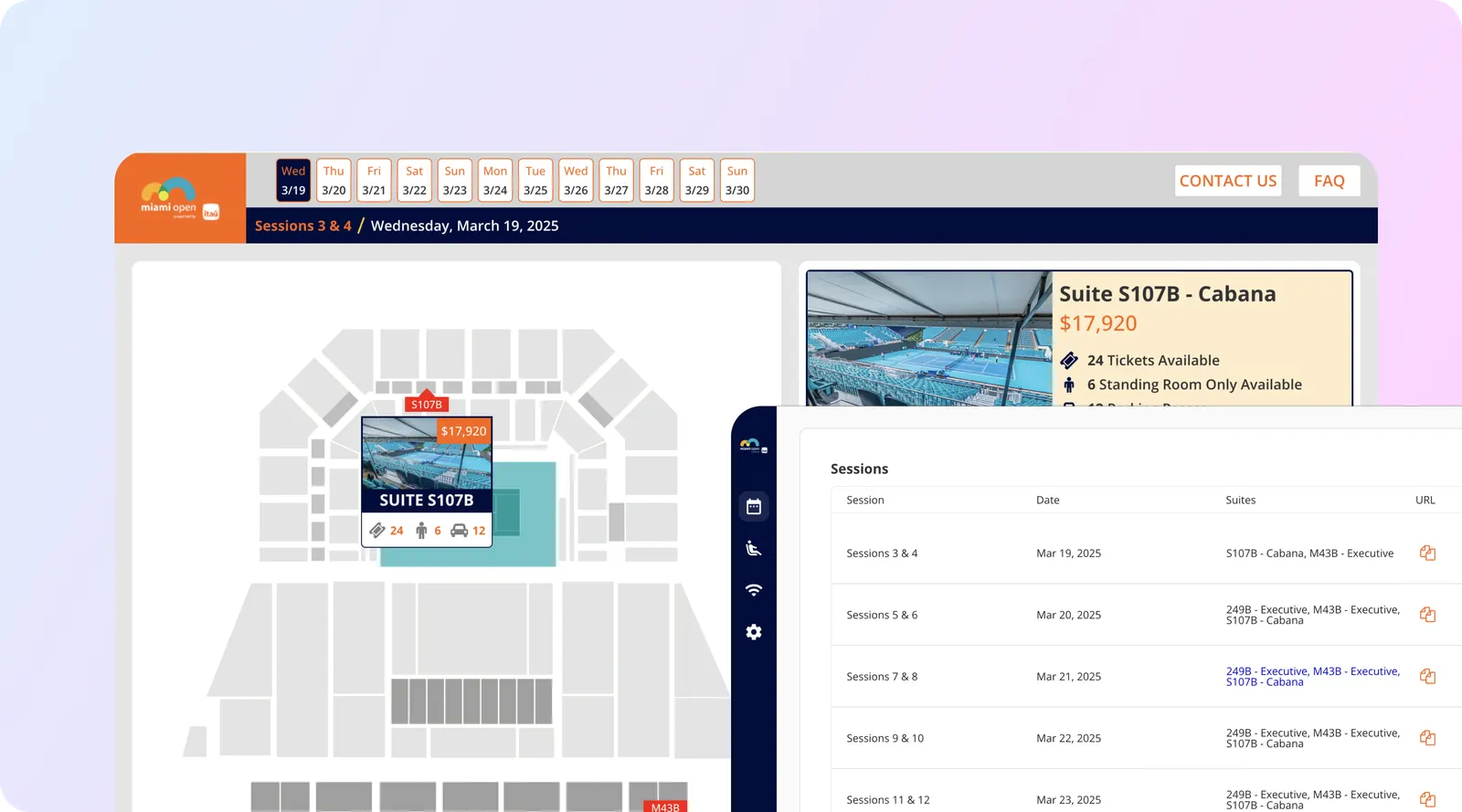
- Enterprise and sports organisations with complex inventory and staff tools, like the Miami Dolphins and Miami Open suites platforms.
Products we have designed and built span fitness and wellness (Stridely, StackStack, Loop), dating (Common Faktor), commerce (Drop My Drip), aviation and travel (Jetstarix, ITS), sports hospitality (Miami Dolphins) and student fundraising (My Rich Aunt).
How to choose a UI UX design agency
- Shipped results. Ask for products that launched and what changed in the numbers. Dribbble shots are not enough.
- A real design system. Ask to see one they delivered, with type, palette, hex codes and contrast rules.
- User testing. Ask when and how they test prototypes with real users.
- Accessibility. Ask which WCAG version and level they design to. The answer should be WCAG 2.2 AA.
- The hand-off. Ask how designs reach developers and who checks the built product against the design.
- Ownership. You should own the design files, the design system and the prototype.
- Build awareness. A team that also builds knows what is practical to ship in your timeline.
Why aibrevo for UI UX design?
- Design and build in one team. 16 in-house engineers in San Francisco led by our co-founder and CTO Shivam Pujara, plus 30+ specialists who work with us remotely. See our mobile app development and web app development services.
- 200+ software projects delivered by our engineering team; every case study in our portfolio includes a design system board like the three above.
- CRM-aware design. We design the forms, portals and flows that feed GoHighLevel, HubSpot, monday.com and Pipedrive, so leads arrive with the fields your team needs.
- Written quotes after a free call.
Start with a free call
Send us the product, the flow that underperforms or the idea you want to shape. We will tell you whether you need research, a UX audit, a design system or a full product design, and send a written quote. Book a free 30-minute call.
We design and build for clients across the US remotely from San Francisco; see app development by state and city.
Sources
- W3C, Web Content Accessibility Guidelines (WCAG) 2.2, W3C Recommendation, checked Oct 31, 2026.
- W3C WAI, What’s new in WCAG 2.2, checked Oct 31, 2026.
- Apple, Human Interface Guidelines: Accessibility, checked Oct 31, 2026.
- Android Developers, Make apps more accessible, checked Oct 31, 2026.
- Fonts, palettes, screens and results: our own case studies linked above.